 That was tasty. However we now have nowhere left to sleep, walk or hang out, let alone go for breakfast lunch or supper. We must signal the human. OK gals lets line up along the front in rows. It's bound to notice us.
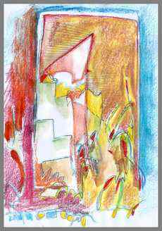
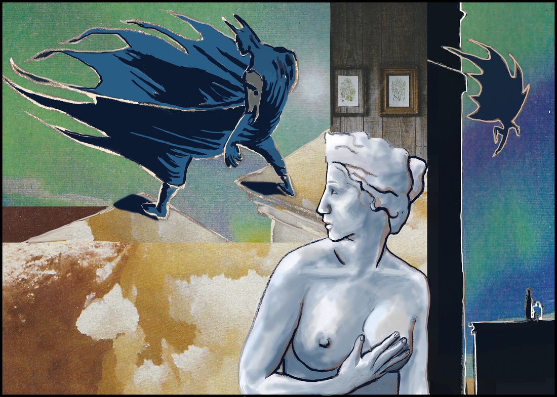
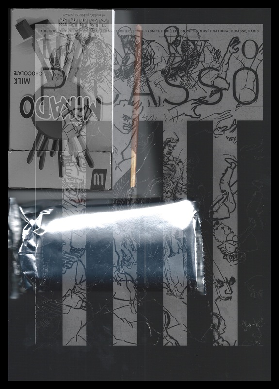
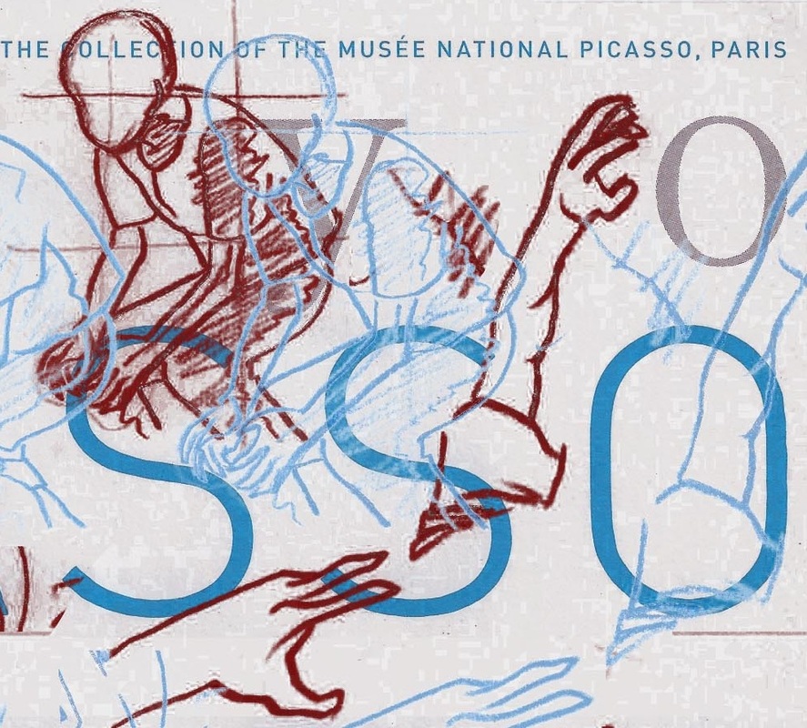
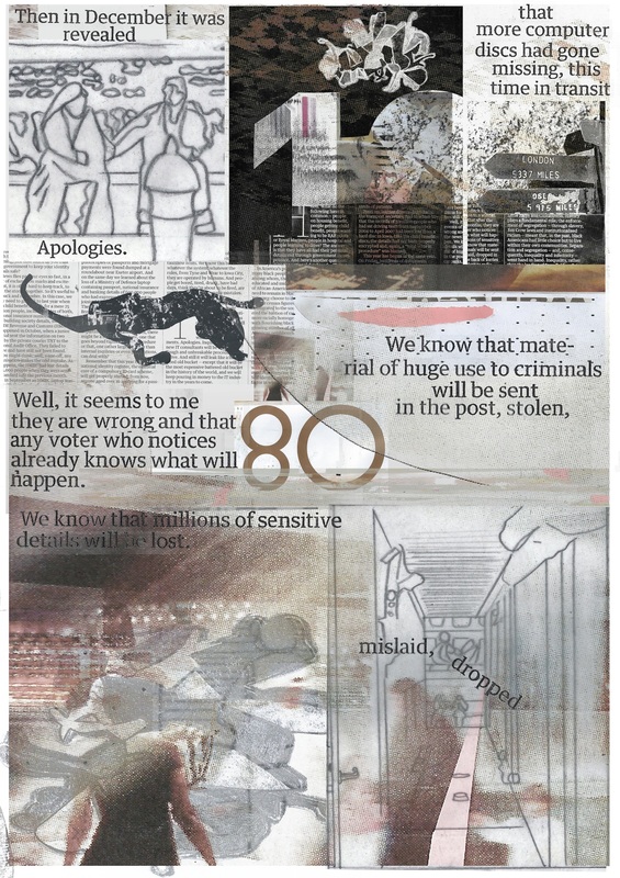
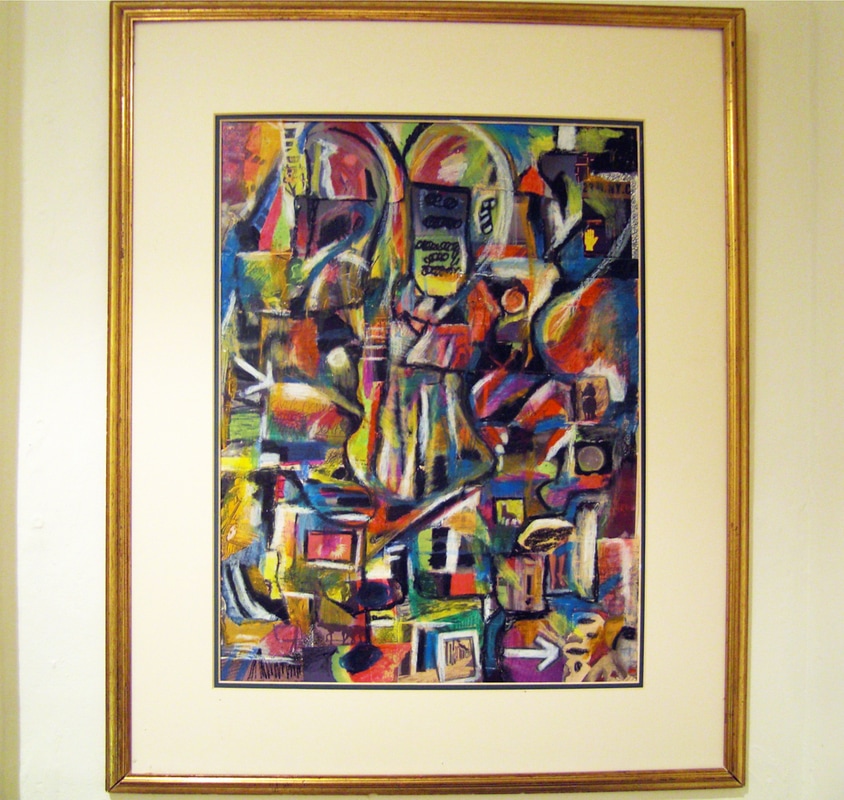 Here is a collage of news paper and magazine cuttings from my ten year collection, which I composed, then highlighted and eventually drew over with oil pastels (created over Christmas this year and just not posted for some reason). You can barely see the collage itself now, but the contents interested me at the time and set my mind going, so that it informed the abstract image that you see before you. It sort of flows like a page of a comic from the top left to the bottom right. I have it on my wall now as you see.
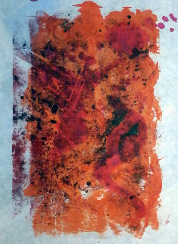
 Print from Plate 3 "Trial"
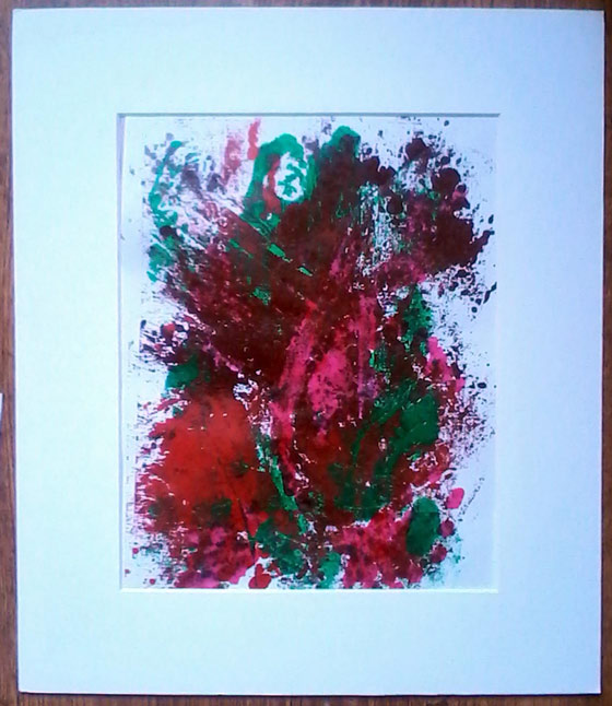
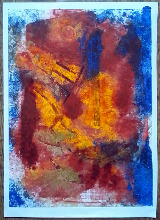 Print from Plate 3 "Perseverance" Collagraph(y) is the layering of printable media to a surface... like collage and printing combined. Monoprints are mono- unique because each printing is different and impossible to replicate. The way the ink is applied is more akin to painting, more manual and randomised than normal printing, and items such as cloth, leaves, debris and feathers are used to create textures that add to an already etched surface. I was able to go to a workshop (at the Leamington Art Gallery) in place of a friend who couldn't go. I found it really refreshing and useful to work in a different media and methodology. On the one hand it was relaxing, on the other fairly challenging. The theme was camouflage or hidden nature. We started out printing our simply carved card with just one colour, then two, then more.. and I made a number of plates (new templates to print from). The printing inks are usually oil based though the workshop leader also brought some water based printing inks as well as your more common translucent inks that you would use for calligraphy or painting with a brush.. The set above are from my third and final plate which was just an abstract design with a sun or moon and various vertical and leaning lines - a landscape or bonfire - if anything. The plate is messy. as it got layered with paint each time it was used. 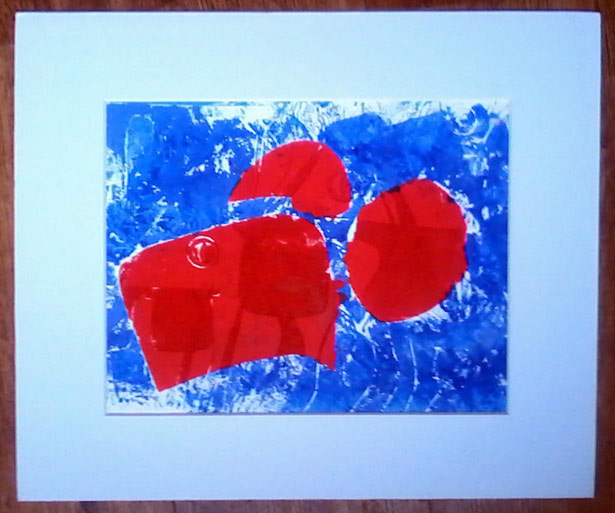 Plate 1 "Glasses" This was the first plate I made. I cut the board with a silhouette of glasses (for looking) and long grass like leaf shapes (for hiding), which makes the darker and lighter tones in the colour. and applied a mask to make two different colours on the plate hoping it would print out the same as I'd inked it up... it didn't. The red is oil based and the blue is water, so by the time I got to use the printing press, the blue had dried up. This is the plate and is far nicer than the print which was a bit of a non event to my mind. It showed me that I needed to apply the ink differently or think about how I used the ink at any rate. Also learned that the paper used to print onto makes a difference too - this paper was perhaps too absorbent. It's a lot of trial and error - experimentation, playing basically. After this I got serious (!) and wanted to try to make something look like something... 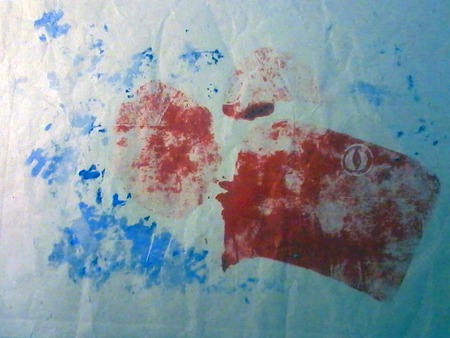 Print from Plate 1 "Eye" ...which is where this second plate came in. I drew something to carve straight off with no prior thought, but it definitely looks Autumnal, a happy ghost or the personification of the Autumn wind. I like the red and blue print above because it is bold and clean, but the one below is more subtle, and I find it interesting because of the textures (some muslin cloth pulled a little over parts of the cardboard). The orange on the plate didn't show up throughout but left a nice random effect, like an echo of an evening sky. (Again the orange was water based and dried up more quickly) I like the brown-red colour of the oil based ink and I was pleased with how the cloth printed into patterns and textures that augment the mood of the figure. 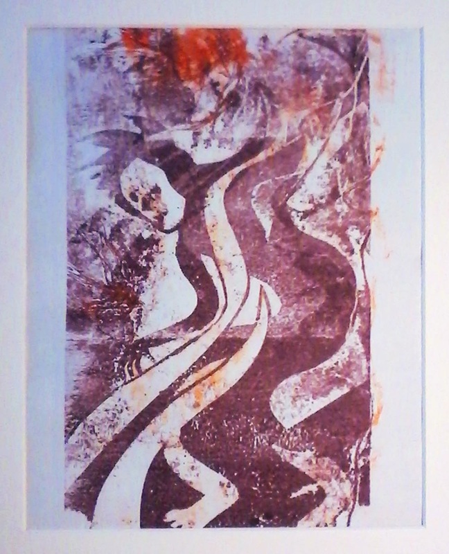 Print from Plate 2 "Figure" I'll definitely use this technique again (it might be a nice different way to make book illustrations). I am pretty sure I could substitute the special inks and printing press for some Acrylic paint (or oils even?) and a rolling pin. The workshop was run by Karen Stephenson who works out of future rabbit studio in Leamington Spa http://www.futurerabbitstudio.com/ Thanks to Kim for giving me her place on the course. 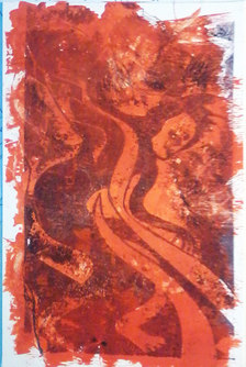 Plate 2 "Autumn" I have recently had the pleasure of drawing some very nice people as superheroes.
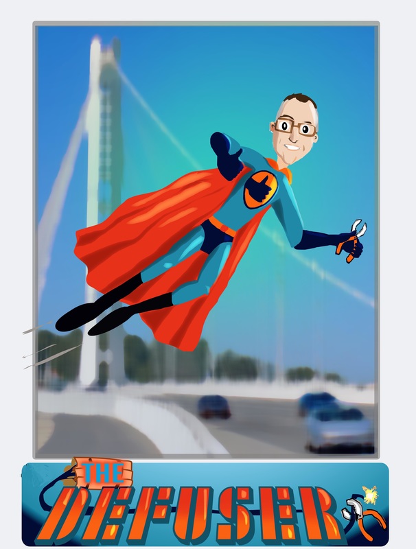
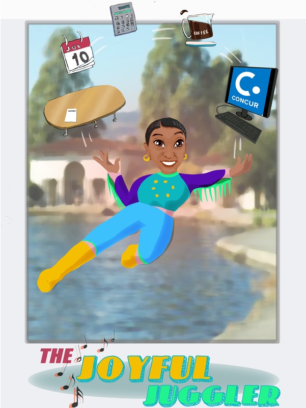
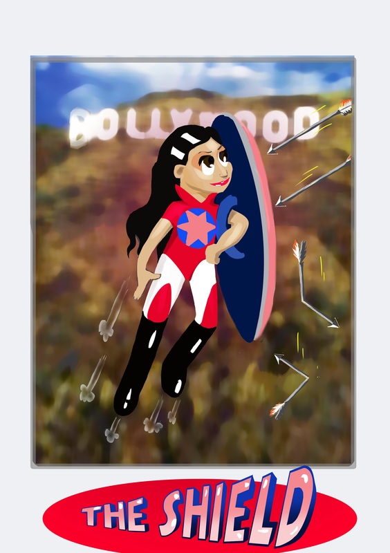
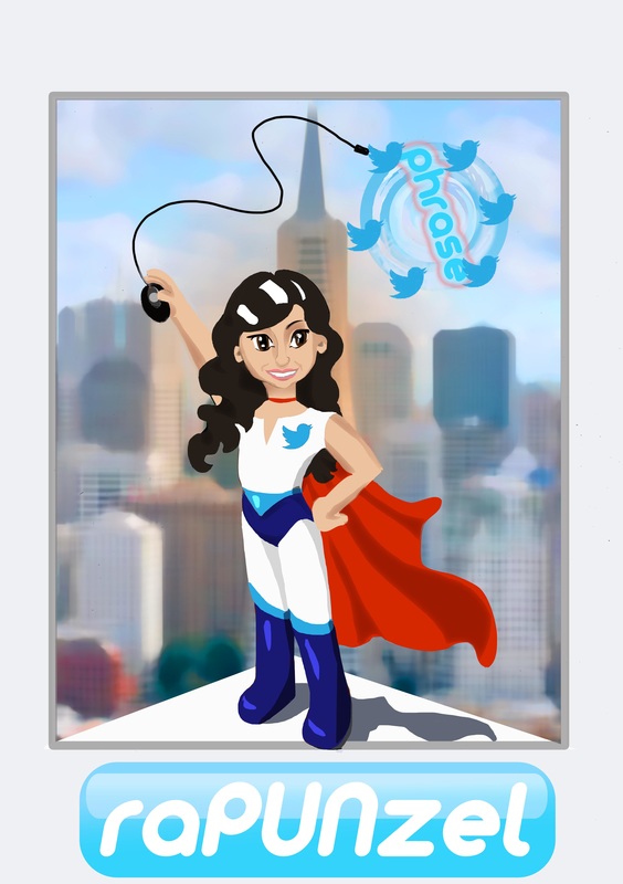
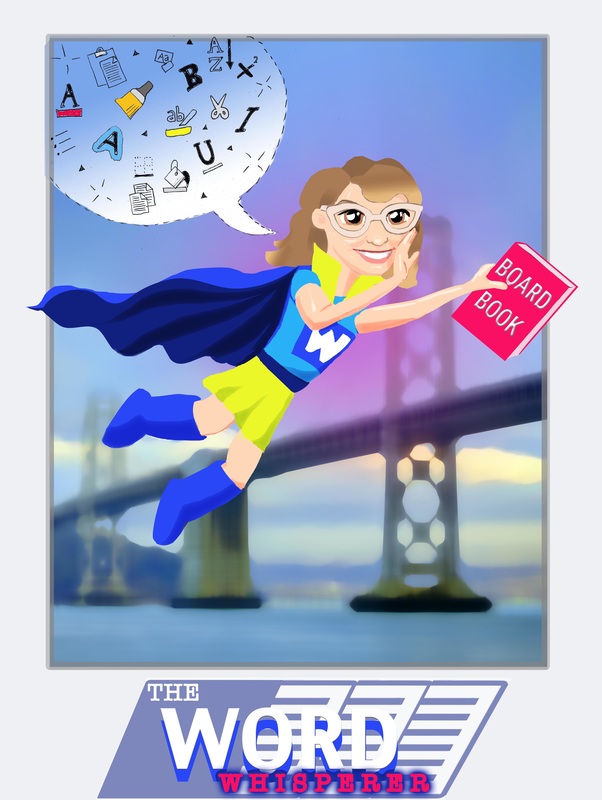
These are some good people who work to help others on a daily basis, and that after all is what superheroes do! The drawings are based on real people who had to identify their core strength in a team, and come up with a name forthemselves were they a superhero. Little did they know their employer had actually commissioned me to draw them in their superhero role. This group loved their avatars, and the idea seems to be picking up new heroes along the way. If you would like me to draw you or someone you know as a superhero just get in touch, This is what my client had to say about my work on this job: "I wanted sketches of my staff as superheroes to honor their specific skills, and it was hard find an artist who could properly - and affordably - bring the idea to life. Rebecca nailed it, and the artwork was a hit with my team and our entire company. She was responsive, creative, open to my ideas, and a joy to work with." Mike Smith Director of Communications The James Irvine Foundation 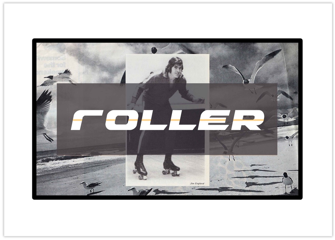 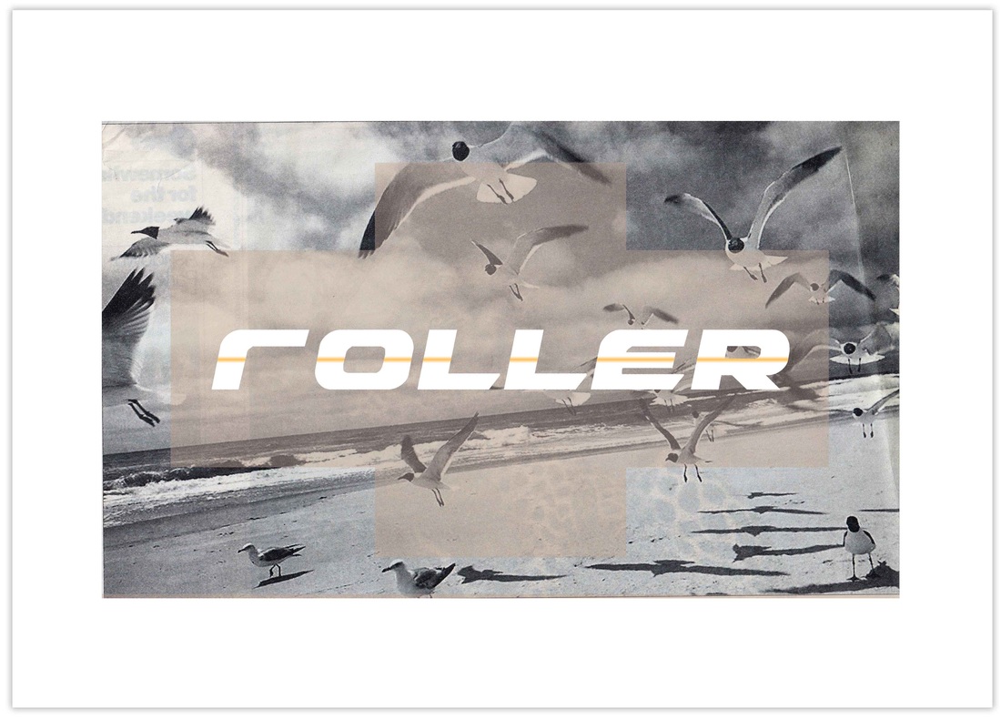 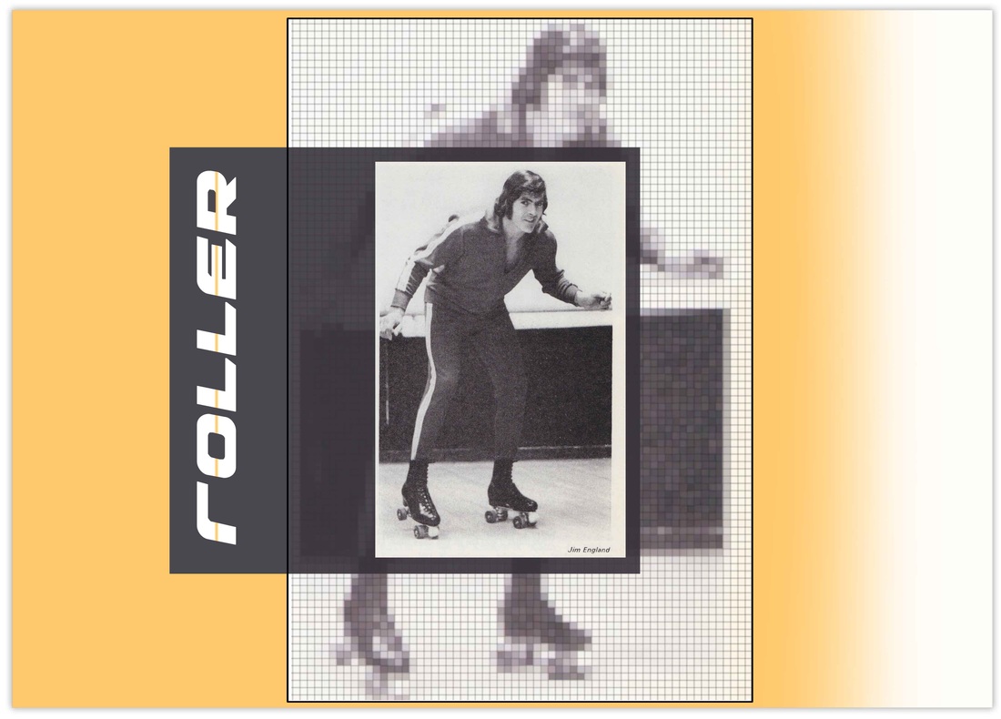 I made this one because I am quite partial to a bit of roller skating. I haven't roller skated for quite a while to be honest but the idea of it still makes me happy. If you happen to be currently near a roller disco and in need of some ridiculous fun, I say get your ankle warmers and sports jacket on and go go go. 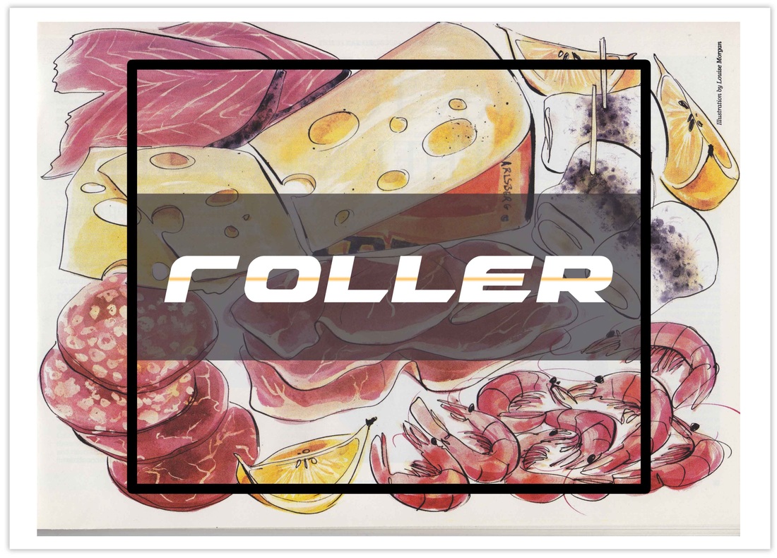 This one's a canteen where your Tapas comes to you on a conveyor belt - as in Sushi.
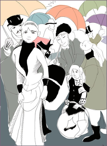
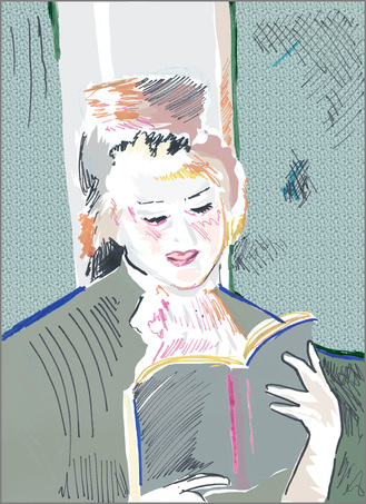
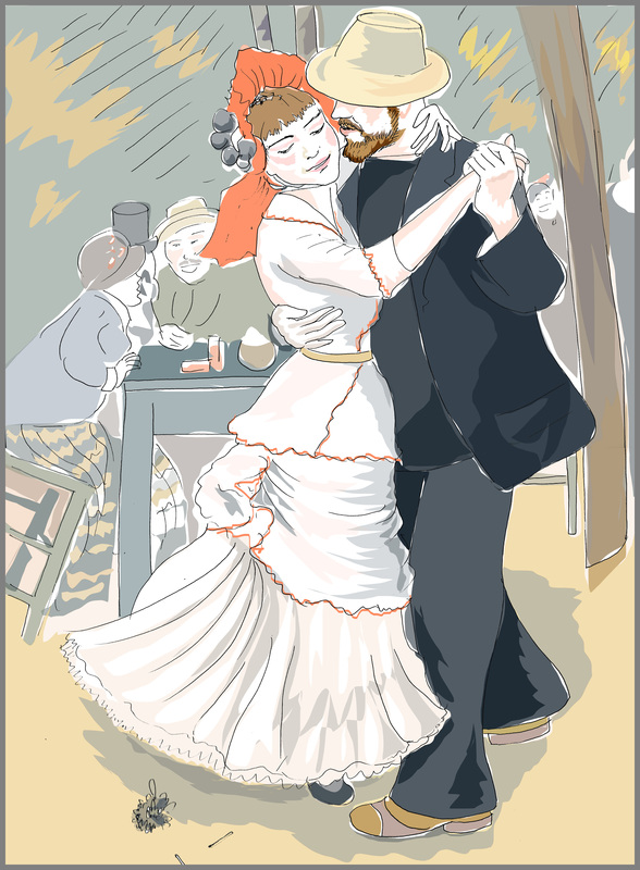 Drawing upside-down; making quick line drawings from Renoir's The Umbrellas (1884), Young Woman Reading (1875) and Dance at Bougival (1883).
The originals are so beautiful; the more time I spent looking at the them the more I appreciated how remarkably he captured a moment in what must have taken months to paint. His paintings are soft and lively, intimate. He was an 'irregularist' and frequently changed his style so that he could continue to imbue his work with the same exuberance he felt for life. Usually he's known for capturing spontaneity in his compositions, where the design makes itself, but in the umbrellas and even in the dancers there is a more formal composition. In the umbrellas you can see a pattern imposed on the crowd to bring the image a sense of unity, creating a more classical design of considerable decorative beauty. Interestingly, from a comic artist's point of view, Renoir was unusual for the impressionist era because he used black in his paintings also because he emphasised the figure in his work, both things the others had eschewed. He was following the tradition of earlier painters. Impressionists like Monet had a new colour theory but Renoir recognised that the juxtaposition of black brings out the colour scheme with more brilliance. In some of his work he also used outlines, but in subtle indistinguishable colours, presumably to keep that softness of form that is so characteristic of his images; he was essentially presenting the human form as a living organism, as part of not separated from its setting. It is an interesting experiment then to put some simple black lines round his soft living forms, though in truth I was doing it as a brief exercise in drawing, I have come away learning a lot more than I expected. But that is why if you are going to study someone it might as well be one of the best. You can't help but get drawn in. Draweveryday58 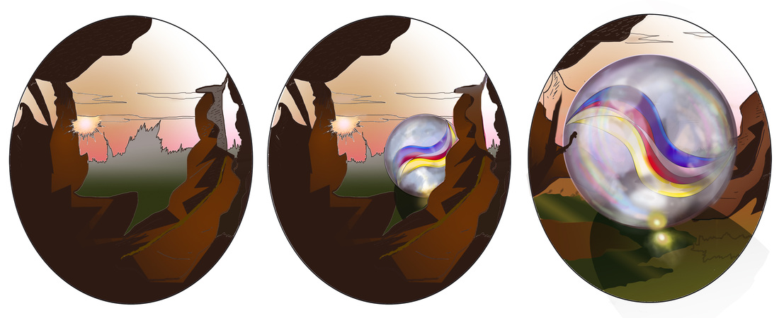 The Pharoah ordered an 18 panel monument so that we could awe the competition into submission, I mean enter a competition and thereby raise our profile in anticipation of the great launch of our Longship. So I'll be working on this for the next few days and rather than deprive you of evidence of my labours, we decided to share it as I go. This is part one of six therefore, and if you haven't listened to the music by the Orb you should.
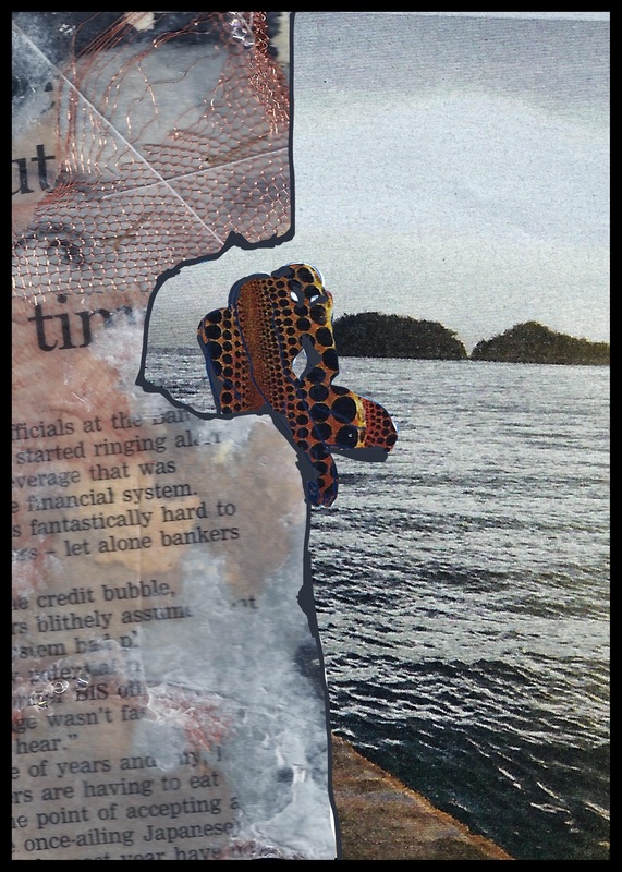
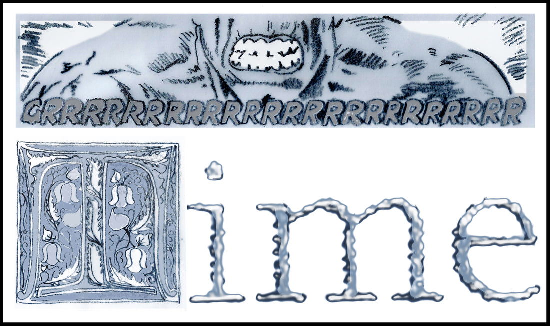
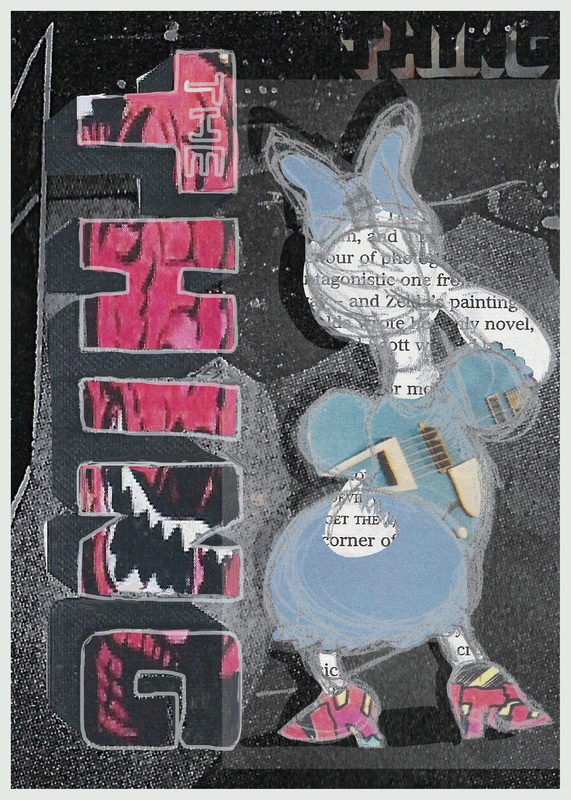
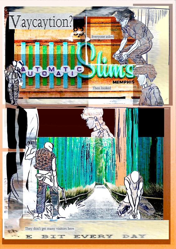
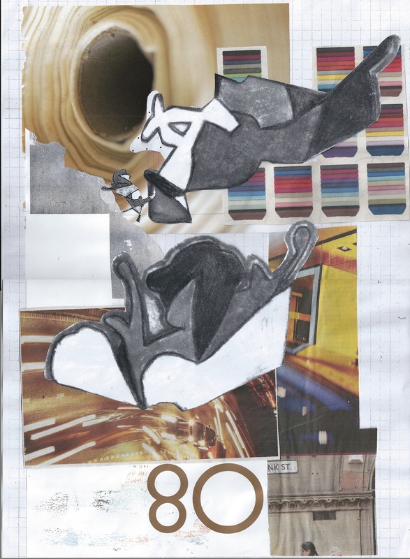
These images between them reference the lines or work of Mobius, Barks, Stotoke, Otomo and Kusama. (Day or two late. Took me a while to track down the name of the Spider-nam artist, apologies). That is my eye in the rock face, a collage using acetone printing, paper and wire, I made back in 2008. The bamboo forest is in Kyoto and I love the style of 50's signage in Memphis! The automatic letters there is nice because while I choose the images I want to play with the process of building the collage of images is pretty automatic for me, I love doing it, always did. Its practicing a different aspect of image making from drafting or sketching, its more about the exploring the idiom, swapping around structures and ideas to create new ones - overall its about the composition. I also like the oxymoron(ic) effect, of contrasting images and styles. Its like holding several different thoughts in your mind at once (which is closer to the experience of living than the linear structure of pure story telling).
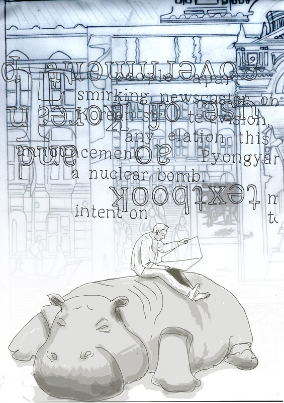
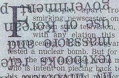
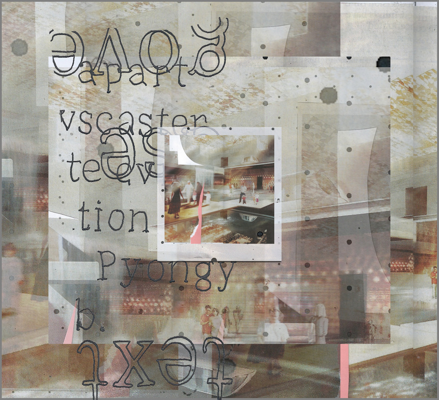
Zoom (repeat). Abe and Article Nine is quite an interesting subject.
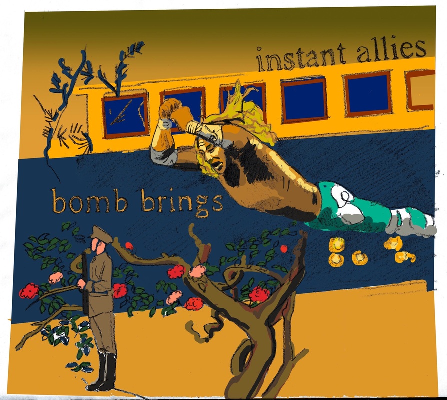
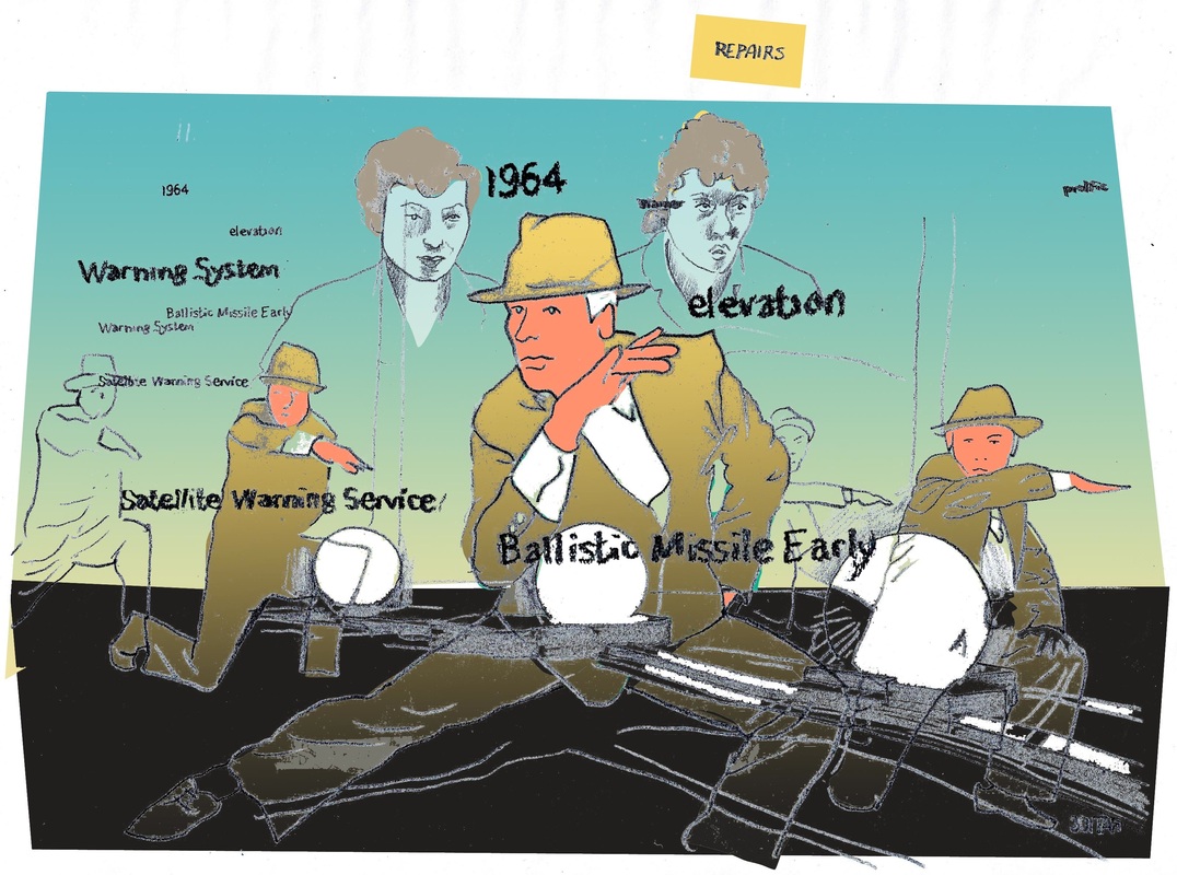
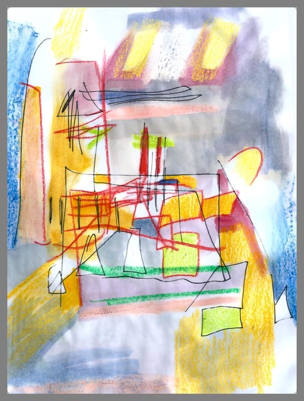
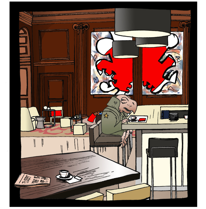
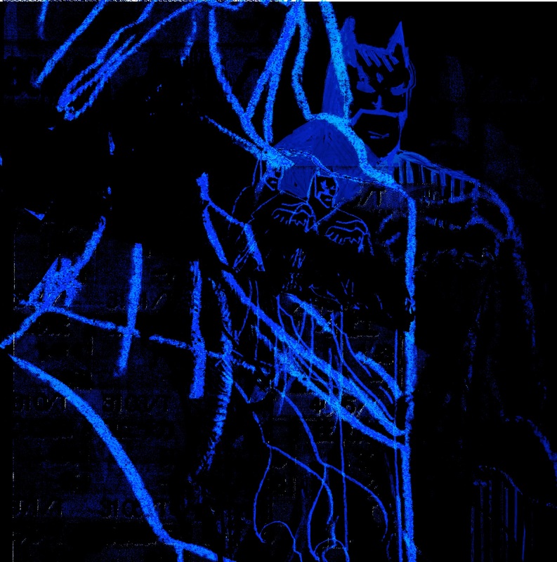
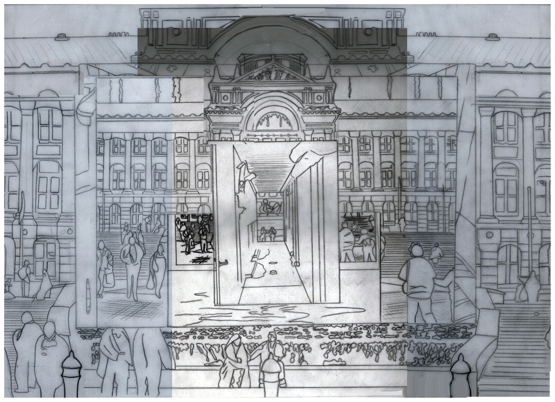
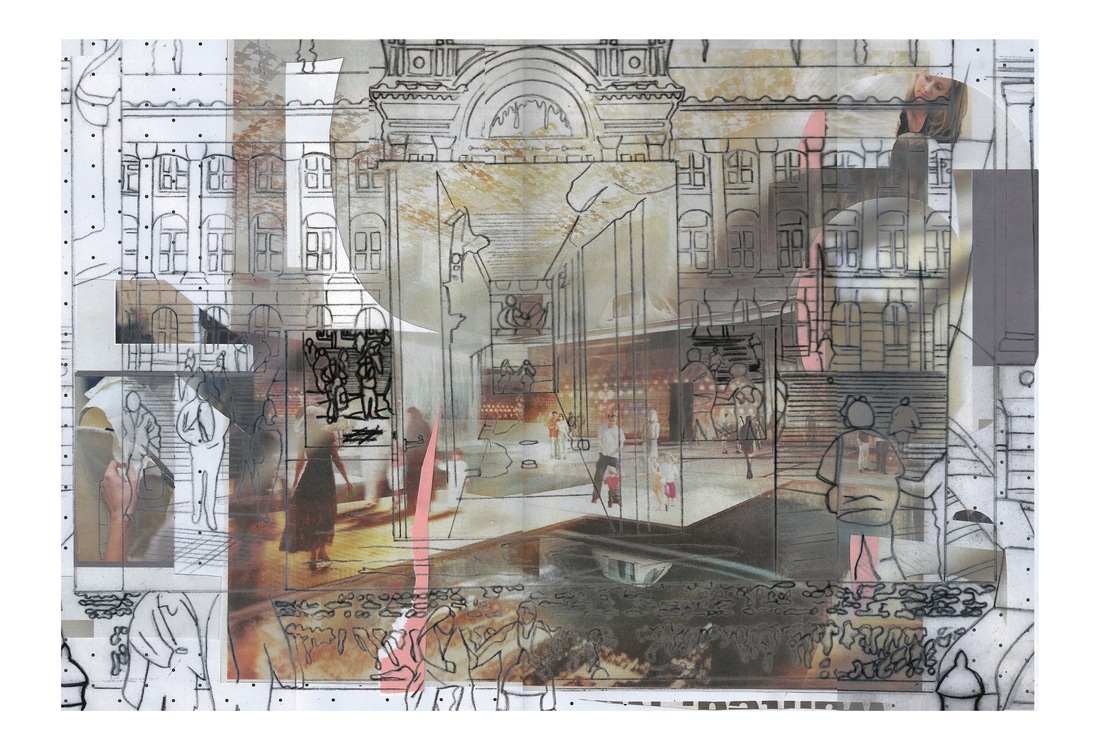
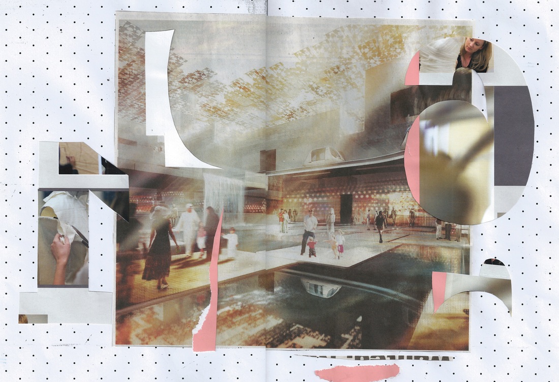
 In continuation of yesterday, what the records show. My starting point, re-analysed and layered, expanded upon with todays drawing - some text, were some collages from 2008 and a drawing from 1997 somehow making more sense now than they did at the time. Made me think of time warps, the flow of things, images, places, doors and texts; contrasted with the cold subject of data, theft, politicking and brinkmanship.
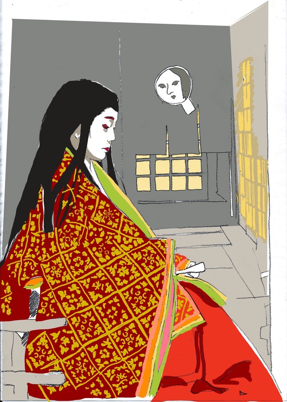
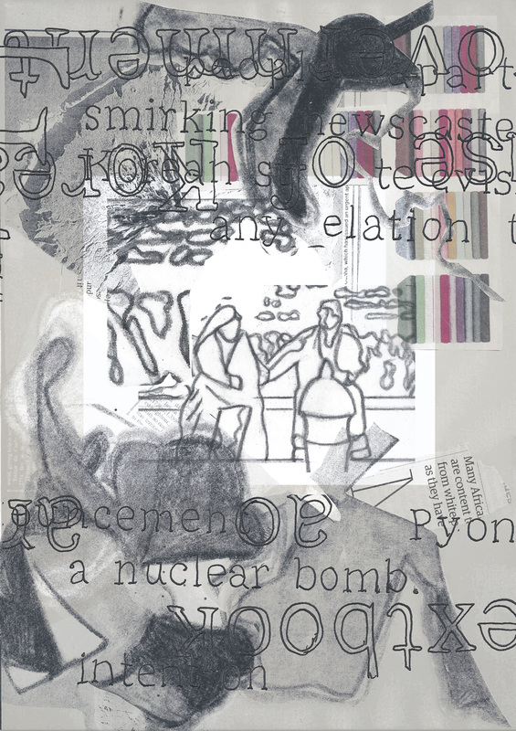
Above are details for closer inspection, but you can read the 2 page comic by clicking on the pages below. 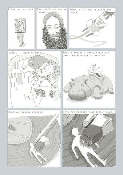 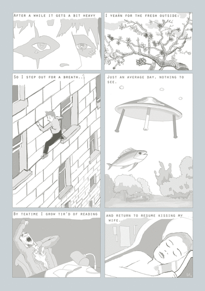 Today I drew (yay). This was made referencing some of my collection of various pictures I've cut out from newspapers, fliers or magazines over the years. Some are collages I made years ago, like the man in panel one. Anyway, after yesterday's experiment I wanted to see about making a more coherent narrative, but still using images in a relatively abstract way. If you're into art history I have referenced Klimt, Van Gogh, Herge and Bosch!
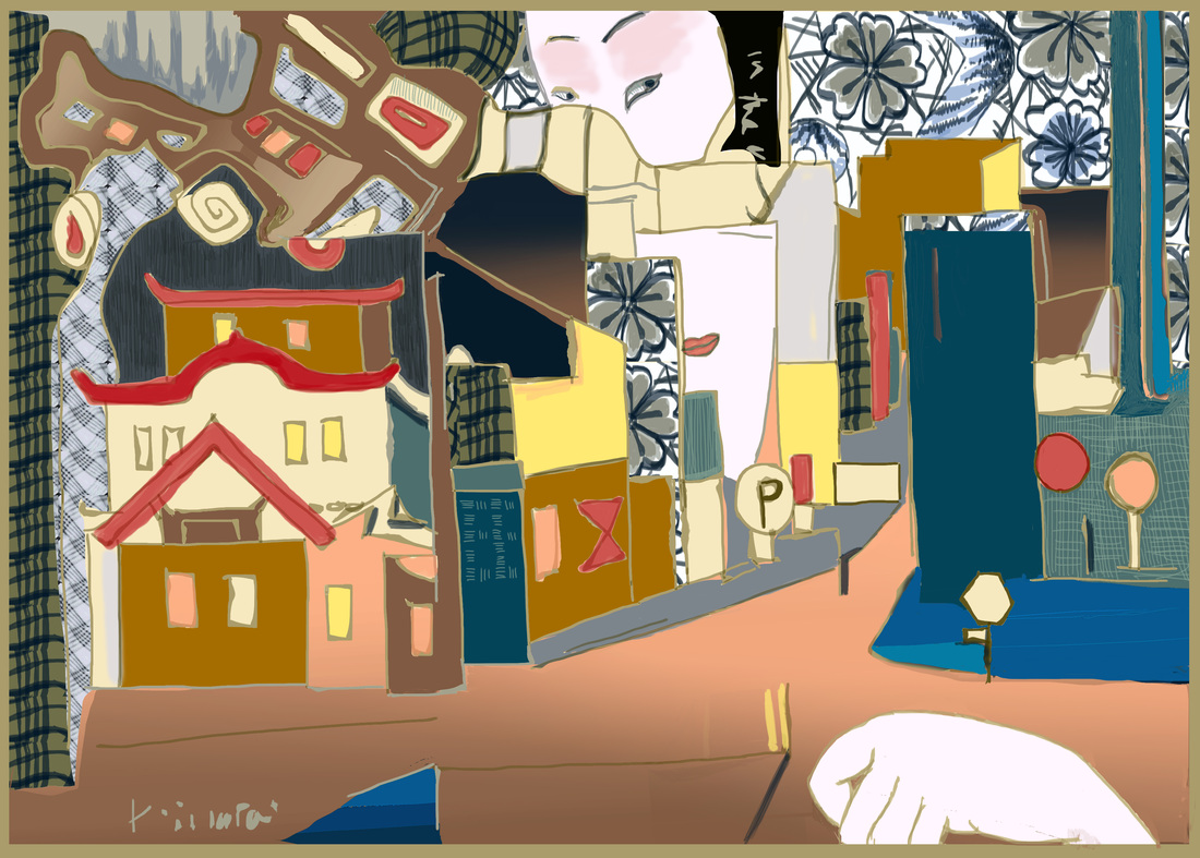 The majority of these lines were drawn in my A6 notebook while wandering around in Tokyo. I put this together from my drawing at the Fujiwara Keep in the Imperial Palace and from a street in Shibuya. Incidentally it was pouring with rain when I drew this which is why its deserted, everyone was under cover, except me.
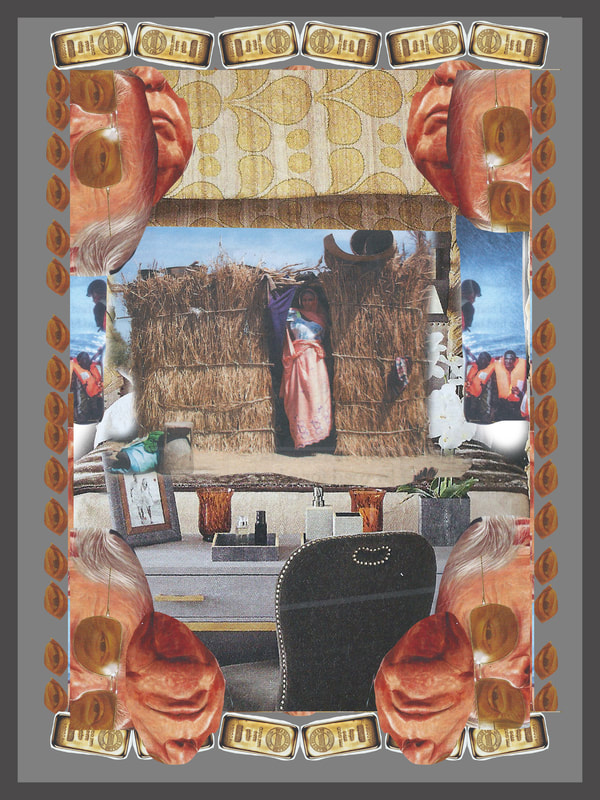
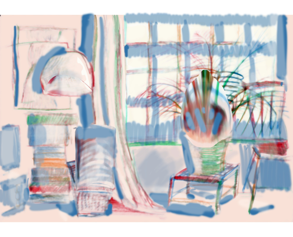
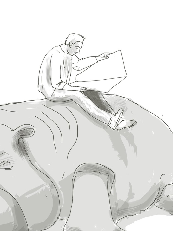
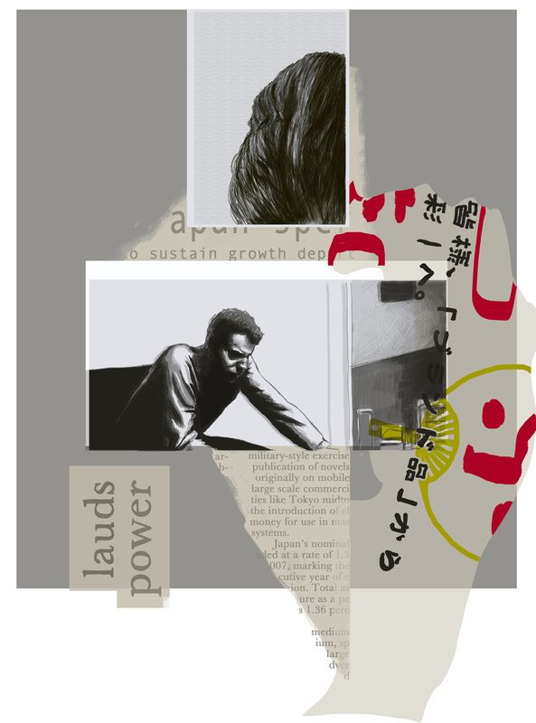 This is a digital drawing of a collage I made shortly after returning from my trip to Japan. It is one of a series of drawings, ideas and scraps I put together as a record and to remind me of the designs and images and internal experiences I was going through at the time. The guy in the collage is actually Steve McQueen but I've not drawn him to life, it was more the posture and mood I was after. The hair is a little intriguing, I was going through a real phase of using body parts in my work as you can see here too. Also I was working as a financial regulator in the international department, hence the frequent use of financial terminology in my work. Finance like many things can seem rather dull and opaque from the outside, but when you get to understand the system a little it is as frail and unpredictable as any other human endeavour, also as important and fundamental for a society as the flow of blood in your body.
|
The ARTIST
etc 
|


 RSS Feed