 Print from Plate 3 "Trial"
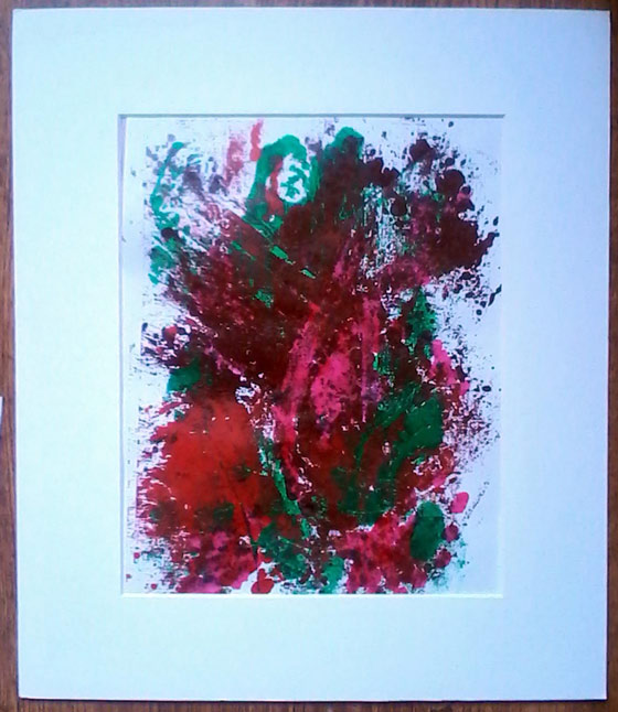
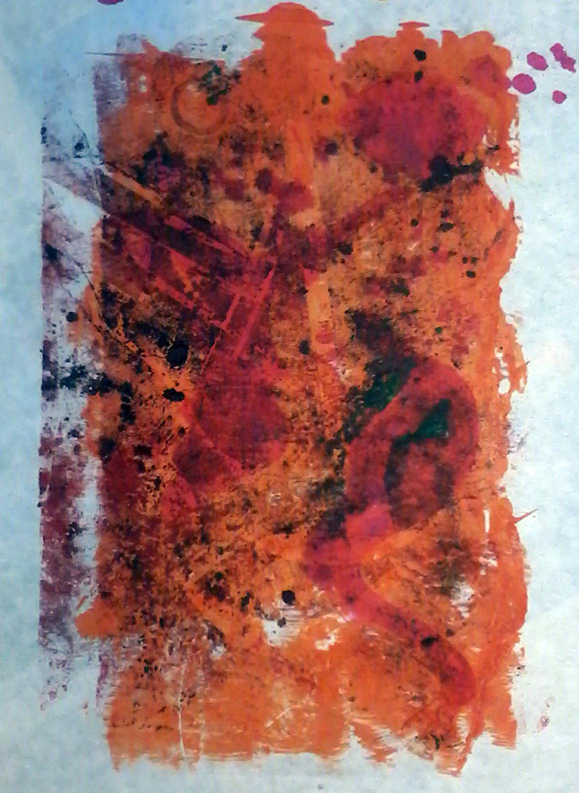
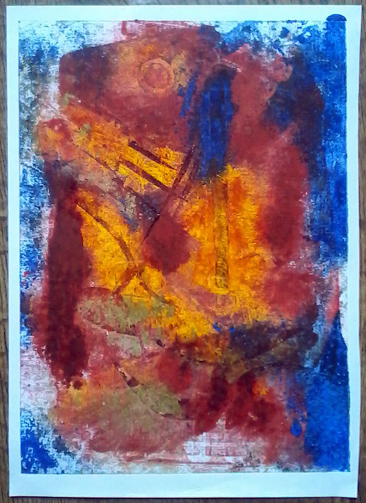 Print from Plate 3 "Perseverance" Collagraph(y) is the layering of printable media to a surface... like collage and printing combined. Monoprints are mono- unique because each printing is different and impossible to replicate. The way the ink is applied is more akin to painting, more manual and randomised than normal printing, and items such as cloth, leaves, debris and feathers are used to create textures that add to an already etched surface. I was able to go to a workshop (at the Leamington Art Gallery) in place of a friend who couldn't go. I found it really refreshing and useful to work in a different media and methodology. On the one hand it was relaxing, on the other fairly challenging. The theme was camouflage or hidden nature. We started out printing our simply carved card with just one colour, then two, then more.. and I made a number of plates (new templates to print from). The printing inks are usually oil based though the workshop leader also brought some water based printing inks as well as your more common translucent inks that you would use for calligraphy or painting with a brush.. The set above are from my third and final plate which was just an abstract design with a sun or moon and various vertical and leaning lines - a landscape or bonfire - if anything. The plate is messy. as it got layered with paint each time it was used. 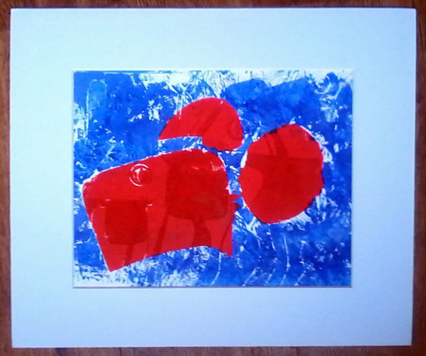 Plate 1 "Glasses" This was the first plate I made. I cut the board with a silhouette of glasses (for looking) and long grass like leaf shapes (for hiding), which makes the darker and lighter tones in the colour. and applied a mask to make two different colours on the plate hoping it would print out the same as I'd inked it up... it didn't. The red is oil based and the blue is water, so by the time I got to use the printing press, the blue had dried up. This is the plate and is far nicer than the print which was a bit of a non event to my mind. It showed me that I needed to apply the ink differently or think about how I used the ink at any rate. Also learned that the paper used to print onto makes a difference too - this paper was perhaps too absorbent. It's a lot of trial and error - experimentation, playing basically. After this I got serious (!) and wanted to try to make something look like something... 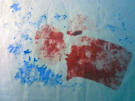 Print from Plate 1 "Eye" ...which is where this second plate came in. I drew something to carve straight off with no prior thought, but it definitely looks Autumnal, a happy ghost or the personification of the Autumn wind. I like the red and blue print above because it is bold and clean, but the one below is more subtle, and I find it interesting because of the textures (some muslin cloth pulled a little over parts of the cardboard). The orange on the plate didn't show up throughout but left a nice random effect, like an echo of an evening sky. (Again the orange was water based and dried up more quickly) I like the brown-red colour of the oil based ink and I was pleased with how the cloth printed into patterns and textures that augment the mood of the figure. 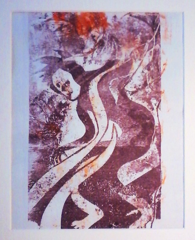 Print from Plate 2 "Figure" I'll definitely use this technique again (it might be a nice different way to make book illustrations). I am pretty sure I could substitute the special inks and printing press for some Acrylic paint (or oils even?) and a rolling pin. The workshop was run by Karen Stephenson who works out of future rabbit studio in Leamington Spa http://www.futurerabbitstudio.com/ Thanks to Kim for giving me her place on the course. 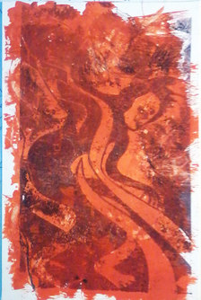 Plate 2 "Autumn" |
The ARTIST
etc 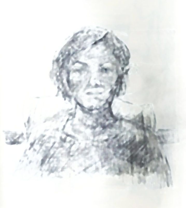
|

 RSS Feed